Where the name came from.
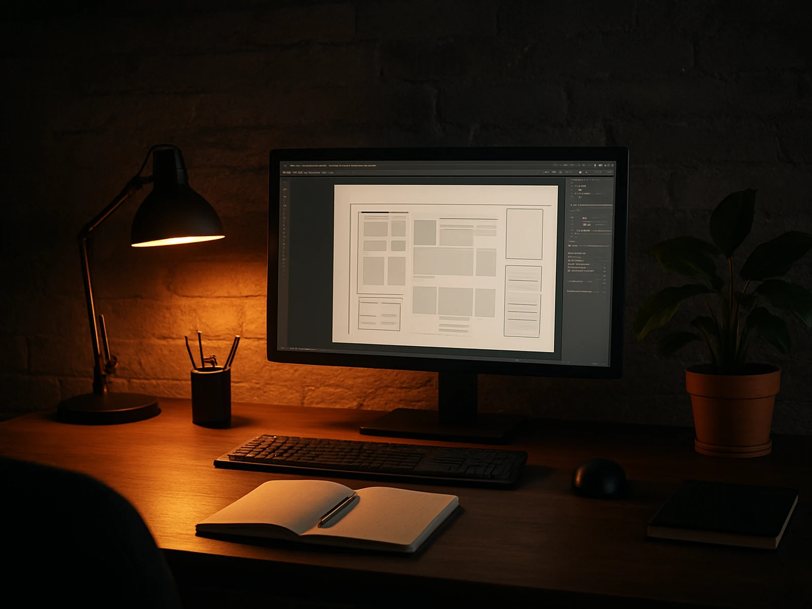
Dark Window Design started in Villa Rica, Georgia in 2018. We were smaller then - two people, one monitor, a lot of local clients with websites that had not been updated since the Obama years. We built what they needed and did it well enough that word got around.
We now have six people and work with clients across the US. The range has expanded - e-commerce brands, architecture firms, healthcare groups, co-working spaces, specialty food businesses. The common thread across everything we take on is that the visual design matters to the business outcome. We are not the studio for clients who think a logo is just a logo.
The name came from something one of our early clients said after their redesign. They said their old website felt like looking through a dirty window - they could see what they were trying to show but everything was unclear. The new one felt like the window was clean. That stuck.
Four things we do not compromise on.
Design with intent
We do not add elements because they look good. Every visual decision is a communication decision. Intent drives form.
Honest scope
What we quote is what we charge. Changes beyond the agreed scope get flagged and agreed before they appear on an invoice.
Limited capacity
We cap active projects deliberately. When we are full, we say so. You get real attention, not an account manager and a junior.
Outcomes not outputs
We track what happens after we hand work over. Not obsessively. But if we built your site, we want to know if it is working.
Projects we are proud of.
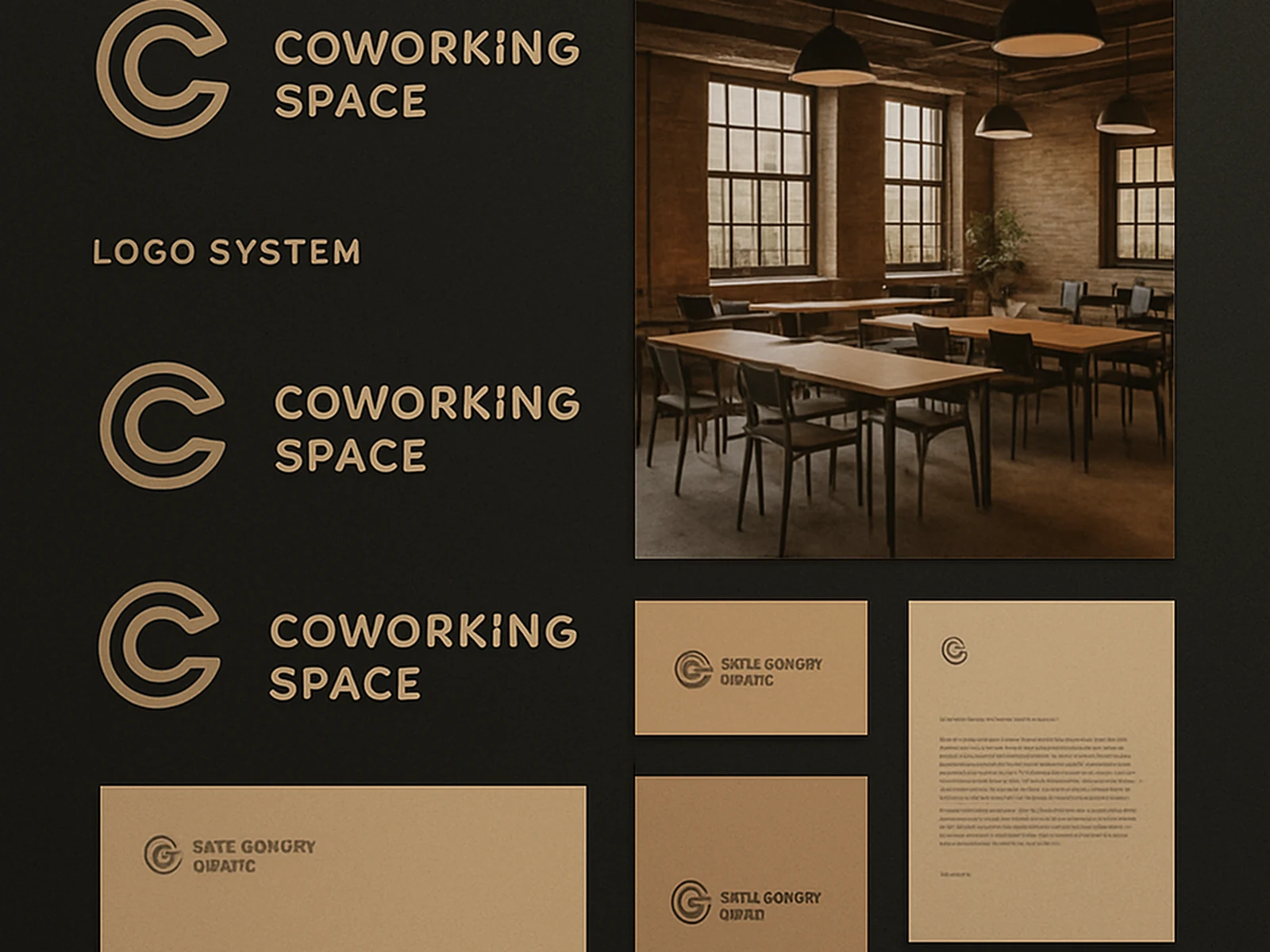
Hatch Collective
A co-working and creative studio in Atlanta with a brand that looked like every other co-working space. White walls, light sans-serifs, stock photography of people smiling at laptops. They knew it. We rebuilt the identity around the actual character of the space - raw, collaborative, and a bit industrial - and built a website that showed it rather than described it.
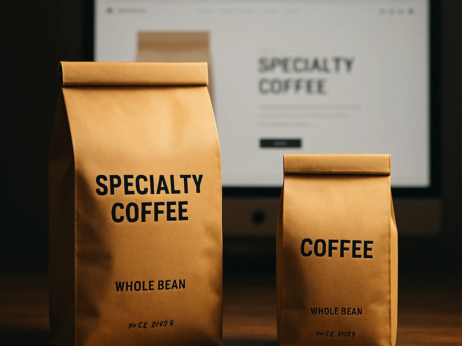
Redbank Coffee Roasters
A specialty roaster selling through farmers markets and a basic Shopify store that had not been touched since 2019. Good coffee, forgettable packaging and website. We designed a visual identity built around the origin stories of their single-origin beans, applied it to packaging and the Shopify store, and restructured the product pages around what specialty buyers actually care about.
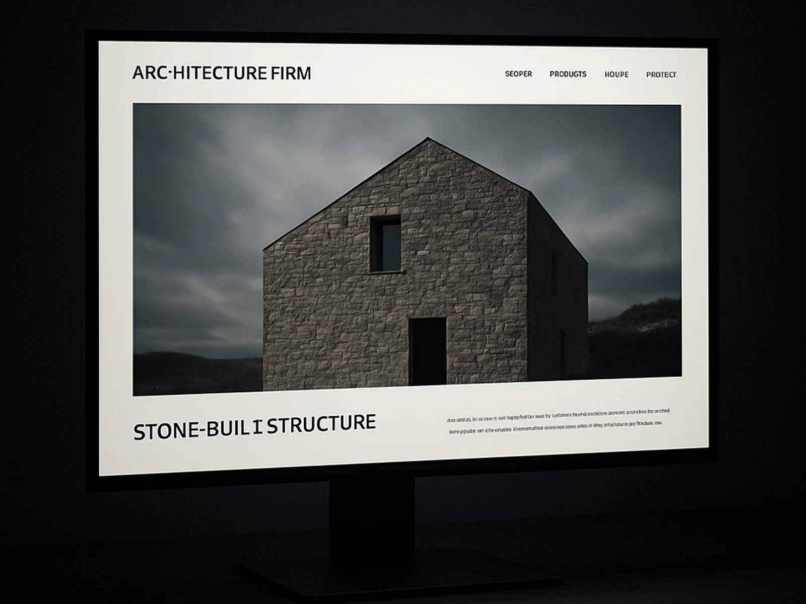
Cairn Architecture
An architecture firm with genuinely stunning project photography and a website that made it nearly impossible to appreciate. Complex navigation, small thumbnails, no story around the work. We simplified the information architecture, gave each project its own proper page with real editorial treatment, and rebuilt the overall site on a custom WordPress theme that their team could update without us.